
CSS glassmorphism: the complete implementation guide
By Altaf Ahmed. Written on . Posted in Tutorials.
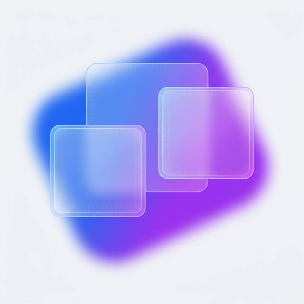
The four CSS properties that create glassmorphism
Glassmorphism is the frosted-glass UI style popularized by iOS and Windows 11. It requires exactly four things working together:
- A coloured background behind the element — the blur has nothing to blur without it
backdrop-filter: blur(Xpx)— blurs everything behind the element- A semi-transparent background:
background: rgba(255,255,255,0.15) - A subtle border:
border: 1px solid rgba(255,255,255,0.3)
.glass-card {
  /* Required: a background gradient or image behind this element */

  background: rgba(255, 255, 255, 0.15);
  backdrop-filter: blur(12px);
  -webkit-backdrop-filter: blur(12px); /* Safari */
  border: 1px solid rgba(255, 255, 255, 0.25);
  border-radius: 16px;
  box-shadow: 0 8px 32px rgba(0, 0, 0, 0.12);
}
Browser support — the one gotcha
backdrop-filter is supported in all modern browsers but requires the -webkit- prefix for Safari. Firefox supported it from version 103. If you need IE11 support (please don't), use a solid fallback background.
Accessibility trap: contrast ratio
Glass effects notoriously fail WCAG 2.1 AA contrast requirements. The blurred background changes depending on what is behind the element. Test your text contrast against multiple backgrounds — especially light ones where white text on frosted glass can drop below 3:1. Use a dark tint or add a text-shadow as a fallback.
When glassmorphism actually works
- Hero sections with a colourful gradient or image background
- Modals and drawers over a blurred page content
- Dashboard widgets on a dark theme
It does NOT work on white backgrounds — there is nothing to blur.
Generate your glassmorphism CSS instantly
Adjust blur, transparency, and border opacity with live preview. Copy the exact CSS with one click.